Thursday, 5 May 2011
Wednesday, 4 May 2011
Grow fade in.
I could have easily added in a fade in circle with the word grow using Premiere Pro, but i chose to do this part of the animation using cell also so it would not look out of place, or too smooth at the end of the animation. to do this i simply slowly faded out the tree in each frame.
and faded in the circle at the same time.
once the circle was faded in i started to rub out the second circle layer that was covering the word grow, to make it look as if the word was being scribbled in.
once the circle was faded in i started to rub out the second circle layer that was covering the word grow, to make it look as if the word was being scribbled in.
The raining triangles.
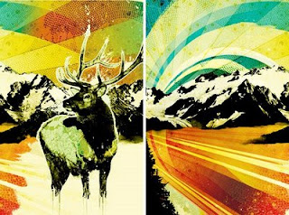
I created the raining triangles by adding a layer ontop of the deer image with the triangles on. Each frame i just gradually moved the traingles down the page. Keeping the deer in the same place.
The second layer of triangles where actually on the same layer but the were covered by the white rectangles to make the appear as if they were falling at a different time. Where as it is all the same layer.
Lens Blur.
I added the out of focus effect in using after effect's lens blur effect. Which allows you to change blur intensity and the depth of field.
I timed each blur so that it's at it's most out of focus when certain piano notes come in during the song.
Shades.
each frame is a slightly different shade to give the uneven effect of hand drawn cell animation, like Steamboat Willie.
The Design Process.
Each frame was drawn in using Photoshop. I took my Illustrator drawing of my deer and imported it as a smart object into photoshop. I then copied my background layer and placed it on top of my illustration, gradually rubbing that overlapping layer out a bit at a time and saved each Image as a Jpeg as i went along to create my frames.
Each jpeg was numbered accordingly so i could import the sequence into after effects easily.
once the deer was introduced fully into the frame i then did the same process for each shape introduced.
Splitting the deer in half proved to be a very time consuming process. Each frame i had to gradually rotate each side separately and in doing so it moved the 2 sides out of place so each side also had to be repositioned back into it's original place to avoid it jumping all over the place in the finished sequence.
Once all 340 frames were completed i then imported the sequences into after effects for editing. Each part is played at a slightly different fps so i could achieve the smoothness i wanted. For example, the starting of the running ink at the beginning of the animation is 12fps then the gradual creation of the deer is 20fps and the falling shapes at around 25fps.
The tree.
I wanted the tree in my animation to be pretty simple. But also look like it could be a dandelion or flower. I went with the black silhouette so it doesn't seem to out of place with the other shapes in my animation.
Tuesday, 3 May 2011
Widescreen.
I'm working at the PAL D1/DV Square Pixel standard dimensions 788px x 576px. But i want a widescreen style shape. So i've added in White blocks at the top and bottom of the screen like you might see in black in film, giving that ultra widescreen vibe.
788px x 576px with white rectangles top and bottom
Hand drawn/photoshop/illustrator.
I did a trial run of hand drawing my images, but quickly decided it was way too time consuming for what i'm trying to do. Also I don't want my animation to be quite as jumpy say Steamboat Willie, but not quite as sharp as Motomichi Nakamura's animations. So i've decided to hand draw my image, then scan to Illustrator and then create each frame using Photoshop. Here's a quick test i did for the first scene.
I've also tried to apply a lens flare kind of effect but only to the black line, i think it make quite an interesting style.
Sunday, 1 May 2011
Lomography
I'm pretty into the whole lomography style prints lately. I want to introduce a film burn feel to my cells. Here's some real nice examples i found a while back in the 10deep summer lookbook.
Saturday, 30 April 2011
Tyler the creator
I've been watching all kinds of different videos by all kinds of videographers and animators for inspiration. What i like about this music video is the naive style of the camera being out of focus quite often, and thought that may be an interesting effect to try and apply to my animation. In keeping with this vintage, slightly messy style I'm trying to achieve.
Friday, 29 April 2011
Steamboat Willie
I was torn for a while between cell animation and animating purely using after effects. I think the style most fitting for what i want to do is cell animation, as i want to achieve and old silent movie, flickery style. I like the real old vintage style of things like Disney's Steamboat Willie, and want to re-create that feel.
Motomichi Nakamura
This animation by Nakamura was a pretty big source of inspiration for me when i was in the story boarding phase. I like the simplicity and bold shapes used. Which gave me the idea of using real simple shapes such as equilateral triangles, circles and droplet shapes in my own animation.
Thursday, 28 April 2011
Key Frame Timing
to work out key frame timing i split my animation into thirds. Part 1 - The deer, Part 2 - The triangles and Part 3 - The tree. Each part being roughly 90 frames each
Wednesday, 27 April 2011
After Effects Sessions.
These are a bunch of videos from After Effects workshops, just getting to grips with the different capabilities.
Thursday, 14 April 2011
The Concept.
The Print to pixel brief was to pick 3 descriptive words that are inspired by the allocated piece of music and to produce an animation based on those chosen words.
My piece of music is Stereolab - Infinity Girl
My 3 words are: Progression, Movement and Growth.
Every time i listen to the piece of music i picture a sequence taking place across a timeline, almost like the progression or growth of something.
Monday, 11 April 2011
Sunday, 10 April 2011
Rayograms.
Some experiments i was doing with rayograms in my workshops. i was trying different ways to capture the depth in the pile of string.
Saturday, 9 April 2011
Emmanuel Radnitzky
Emmanuel Radnitzky, better known simply as Man-ray. He was a modernist most well know for his abstract photogrpahy work.
Friday, 8 April 2011
Thursday, 7 April 2011
Blaine Fontana.
I love the characters that Blaine Fontana uses in his work. I often use his book Sedimental Promises as inspirational flick through when given new briefs. When i think of animations, i automatically think of characters, and i think a well drawn character is the key. I especially like Blaine's more symmetrical paintings and plan to capture that feel in my animation using one of my own characters.
ISO50
I'm a pretty big fan of both Scott Hansen's photography work and his Illustration/Graphic Design. I'm especially a fan of the earthy warm colours he uses. For my animation i want to use some real earthy tones and lomography feel of Hansen's style.
Subscribe to:
Comments (Atom)


